Share:
Why Healthcare Websites Carry Greater Responsibility
For organisations operating in health and community wellbeing, a website is not a marketing asset. It is infrastructure.
In Aotearoa New Zealand, more than 1 in 4 people identify as living with a disability. Add to that an ageing population, increasing digital reliance, and heightened expectations around online access to services, and the role of digital platforms becomes clear.
Accessibility is not a design trend. It is a public responsibility.
In the context of healthcare website design NZ organisations must treat accessibility as foundational. For organisations building on platforms like Webflow, this means structuring content, CMS architecture, and performance with accessibility embedded from the outset. These websites often act as the primary gateway to support, funding information, crisis resources, referrals and clinical innovation. When accessibility fails, real people are affected.
Accessibility as Strategy, Not Compliance
Too often, accessibility is treated as a checklist item. Add a plugin. Increase the font size. Run an automated audit and move on.
That approach misses the point.
True accessibility begins at the strategy level. It starts by identifying distinct audience groups and understanding their context. A neurologist, a caregiver, a trauma survivor, an elderly patient and an investor do not approach a website with the same needs or mental state.
If the information architecture does not reflect that reality, no visual overlay will fix it.
When approaching healthcare website design in NZ, we begin by mapping audience pathways before a single design frame is created. We structure content around real-world journeys. What does someone need in a moment of urgency? What does clarity look like for someone navigating cognitive fatigue? What does reassurance feel like when trust is fragile?
We design in alignment with recognised accessibility standards such as WCAG, but compliance is the baseline. The objective is usability under pressure.
Clear typography. Strong contrast. Logical hierarchy. Reduced cognitive load. Predictable interactions. These are not aesthetic decisions. They are operational ones.
Last year, we delivered three very different health and wellbeing projects. Each required a distinct strategic response.
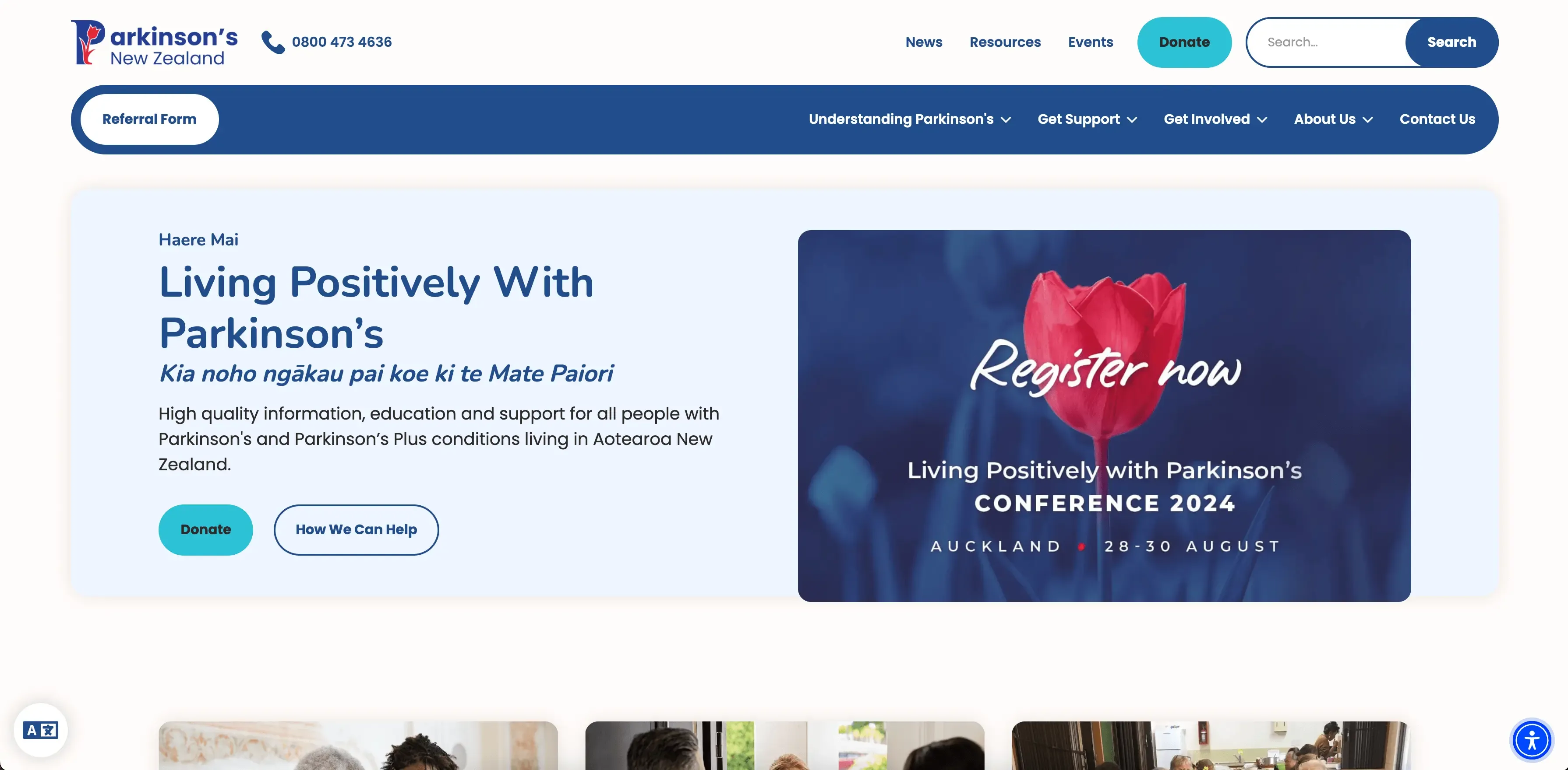
Parkinson’s New Zealand – Designing for Dignity
Parkinson’s New Zealand is the only national charitable trust supporting people living with Parkinson’s in Aotearoa. Many within this community experience changes in motor control, vision and energy levels. That reality shaped every decision.
The redesign focused on clarity, legibility and simplicity. Navigation was streamlined. Content was structured to minimise overwhelm. Interactions were refined to support users who may struggle with fine motor precision.
Assistive tools via UserWay were implemented to extend personalisation, but the core experience itself was built to be accessible by default.
Accessibility should not feel bolted on. It should feel natural.
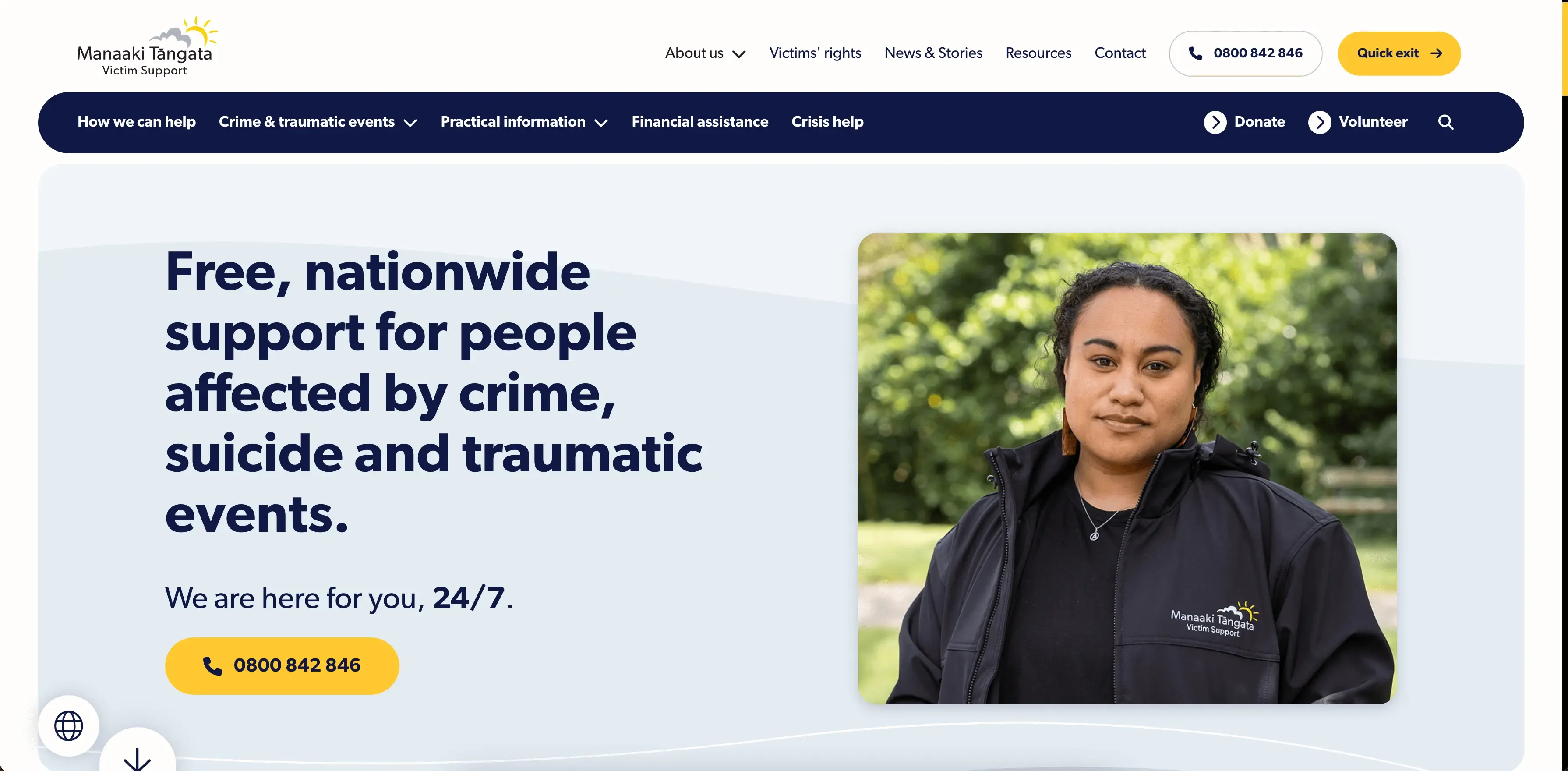
Manaaki Tāngata | Victim Support – Clarity in Crisis
Manaaki Tāngata | Victim Support operates at the intersection of justice, trauma response and community wellbeing. For many users, the website is accessed during moments of distress.
In these contexts, friction is not an inconvenience. It is a barrier.
The strategic focus was on information hierarchy and emotional clarity. Pathways were mapped around urgency and real-world scenarios. Language was simplified without losing meaning. Navigation was structured so users could identify relevant support within seconds.
In healthcare and wellbeing website design NZ organisations must consider emotional state as much as functionality. Trauma-informed digital design is no longer optional.
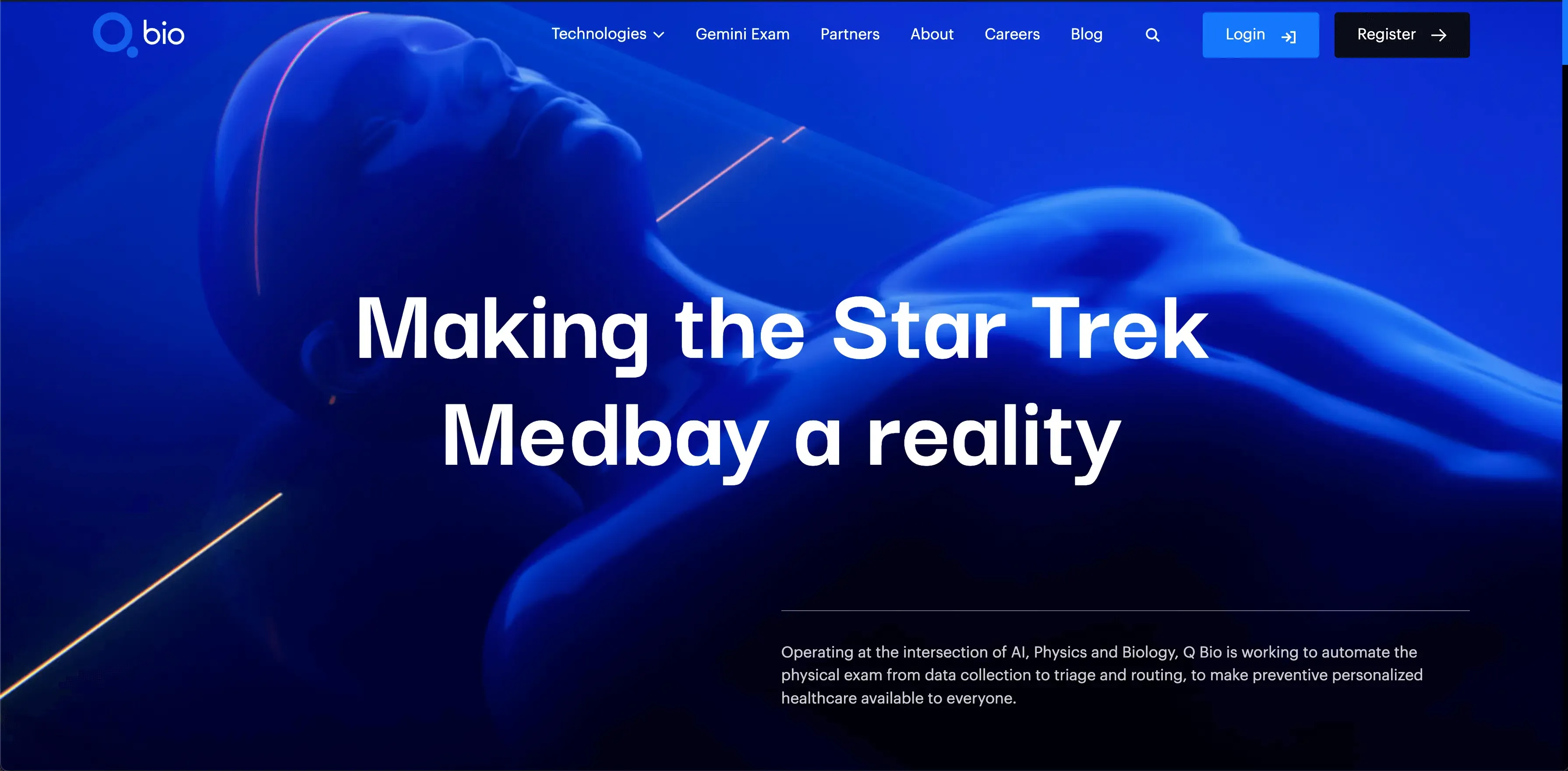
Q Bio – Making Complex Science Understandable
Q Bio operates at the frontier of AI, physics and biology, working to reshape preventive healthcare. Their challenge was different. The audience included investors, researchers and partners who required depth and credibility.
The task was to communicate complex scientific innovation without alienating non-technical stakeholders.
Through structured storytelling, disciplined content hierarchy and restrained motion design, the platform allows the science to lead while remaining accessible. Clarity builds confidence. Confidence builds trust.
Even in advanced health technology, accessibility matters. Complexity should never be confused with opacity.
The Standard is Rising
The expectations placed on health organisations are increasing. Patients expect digital clarity. Funders expect transparency. Regulators expect compliance. Communities expect inclusion.
In the New Zealand context, healthcare website design must reflect this reality. Accessibility, performance, mobile optimisation, content clarity and CMS resilience are baseline requirements.
Our experience as New Zealand’s first Webflow Enterprise Partner informs how we build resilient healthcare platforms.
A website in the health sector is not simply a brand expression. It is a public interface.
Accessibility is not a feature. It is a responsibility.
And in healthcare, responsibility is non-negotiable.