Share:
Originally published August 2021. Updated 2026 with new context. See notes below.
2026 editor's note: This article was written when the second version of the Psychoactive website launched in 2021. It's still the definitive piece on where the brand came from on the surface: the ethos, the name, the logo, the tessellation, the metamorphosis metaphor. The original article is credited to "Alex": that's Alexandre Bannwarth, the designer who co-created the Psychoactive logo with Andrew, and who designed and animated the now-iconic metamorphosis tessellation. Alexandre's no longer at the studio, but the visual foundations he built still define the brand today. The logo on the new site is the same one he co-created in 2018. The tessellation lives on the About page of the 2026 site.
One thing the 2021 article doesn't tell, and the new About page does: Psychoactive came out of Andrew's Master's research on how technology could create meaningful emotional states, using neurofeedback paired with AR and VR to simulate psychedelic therapy. That deeper context anchors why "Psychoactive" was the right name in the first place, and why the studio's been preoccupied with how digital experiences profoundly affect people ever since. What's evolved since 2021 is the studio itself: the work we take on, the tools we use, and the way we express the brand on our own website. We relaunched in 2026 as Psychoactive 3.0, and three companion pieces are linked at the bottom.
The original article begins below.
Just as we tell all our clients, clear brand identity and strategy are the cornerstones of any successful organisation. And while we'll cover creating flashy logos and eye-catching splash page animations in this article, these are only the final steps in developing an impactful brand.
In order to effectively communicate who we are, we must first understand what we hope to achieve, and what core values drive us.
Starting With Our Ethos
Psychoactive Studios evolved from what can essentially be boiled down to four core aspirations:
Innovation — Designing at the cutting edge, creatively employing the latest technology to create impactful experiences.
Mastery — Drawing together highly talented individuals to consistently hone our respective crafts and strive for mastery.
Communication — Collaborating with diverse people to share ideas and experiences capable of profoundly affecting communities and creating interpersonal connections.
Passion — Contributing to meaningful projects with a desire to grow and evolve as professionals and individuals.
This ethos would inform our choices through every stage of developing the brand, starting with picking a name and telling our story.
Hatching a Brand and Its Story
Every brand name strives to be original, meaningful, and memorable to exemplify who we are as a brand, and what we do.
Psychoactive (adj.) — Capable of profoundly affecting the mind
The Psychoactive adjective arose almost organically from our brainstorming sessions. By its very definition, it coincides with our stated goal of profoundly affecting people and communities. Yet it meshes on some level with each of our core values. Indeed, psychoactive substances have the potential to open the mind to new ideas, to inspire art, innovation and personal growth as well as feelings of empathy and community.
While taboo in the west, we envisioned that the name would fit seamlessly as part of our wider theme of a frog's metamorphosis. Indeed the skin secretion of the Colorado River Toad and Giant Leaf Frog have long been used for their psychoactive secretion in mesoamerica and the amazon.
Metamorphosis (n.) — A profound change of physical form or substance
This process of metamorphosis in amphibians would make the perfect metaphor for the way we help brands, communities, and teammates to grow and evolve. It would also offer countless opportunities to establish a memorable, cohesive visual identity and tone of voice.
Establishing a Visual Identity
Having established a strong conceptual foundation, we could move onto how to best communicate our story of psychoactive metamorphosis. In an effort to create a recognisable Tone of Voice, "Amphibian" vocabulary is present throughout our website, as we draw parallels between ourselves and frogs, toads, salamanders and other amphibians.
But they say a picture is worth a thousand words, and we believe truly memorable branding is an exercise in visual storytelling.
A story that starts with a logo, and in this case, a tadpole. While we explored many avenues, and frogs, it only made sense that our logo would depict the transitional stage of a frog's metamorphosis. In between egg and adult, the tadpole could be drawn into a minimal yet dynamic shape that can be used with great versatility.
Keeping the logo a flat color, with minimal details and designing it within a square / circle makes it possible to use almost anywhere in a composition, as it will look good and recognisable in any color and at any size. The careful consideration of line weights and negative space keeps the logo legible and pixel-perfect down to 30px. Paired with the clean, bold typeface Poppins, the logo and wordmark work together to form a highly legible, timeless lockup.
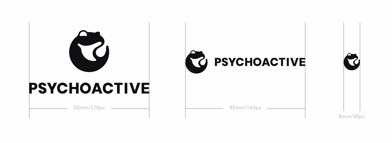
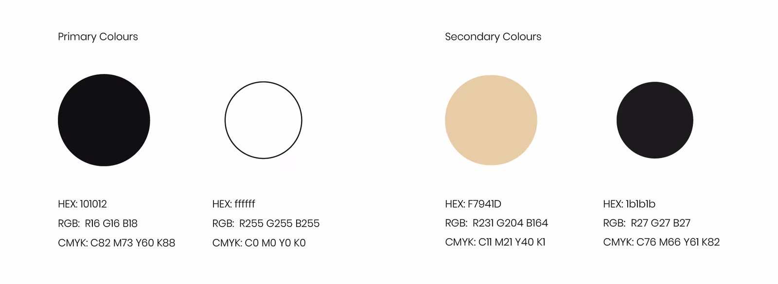
For colors, we took inspiration from the high-contrast, black and white illusions of the Op Art movement with sparing use of a premium, polished gold highlight.
While a conservative, adaptable logo is essential in establishing a timeless, reputable brand, we also wanted to illustrate our metamorphosis metaphor with a little psychoactive flair.
Designing the Psychoactive Tessellation
Tessellation (n.) — An infinite repeating pattern of shapes without overlaps or gaps
It would be impossible to discuss illustrating metamorphosis without mentioning the mind-bending tessellations of dutch graphic artist M.C Escher and specifically his Metamorphosis series.
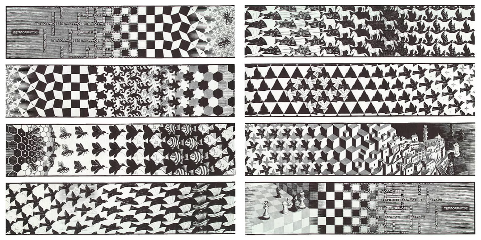
M.C. Escher, Metamorphosis III, woodcut, 1967-1968
In his intricate merging of mathematical, geometric patterns with figurative depictions of animals and insects, Escher explores concepts of infinity, metamorphosis, and the cycle of life in mesmerising, almost psychedelic ways.
Yet as revolutionary and breathtaking as his work is, he was limited by the technology of his time, painstakingly designing and reproducing his patterns one tile at a time. With the access to modern computers and automation, we were free to dream up not only a static representation of metamorphosis, but a fully animated artwork able to repeat indefinitely across space and time.
While figurative tessellation may seem complex at first glance, most are actually built on top of straightforward grids and follow very simple rules. In euclidean geometry, three regular polygons can be used to create a regular tessellation without gaps or overlap: Squares, Triangles, and Hexagons.
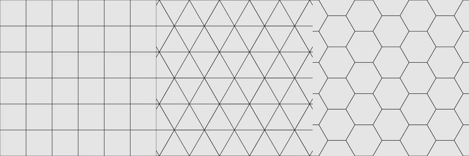
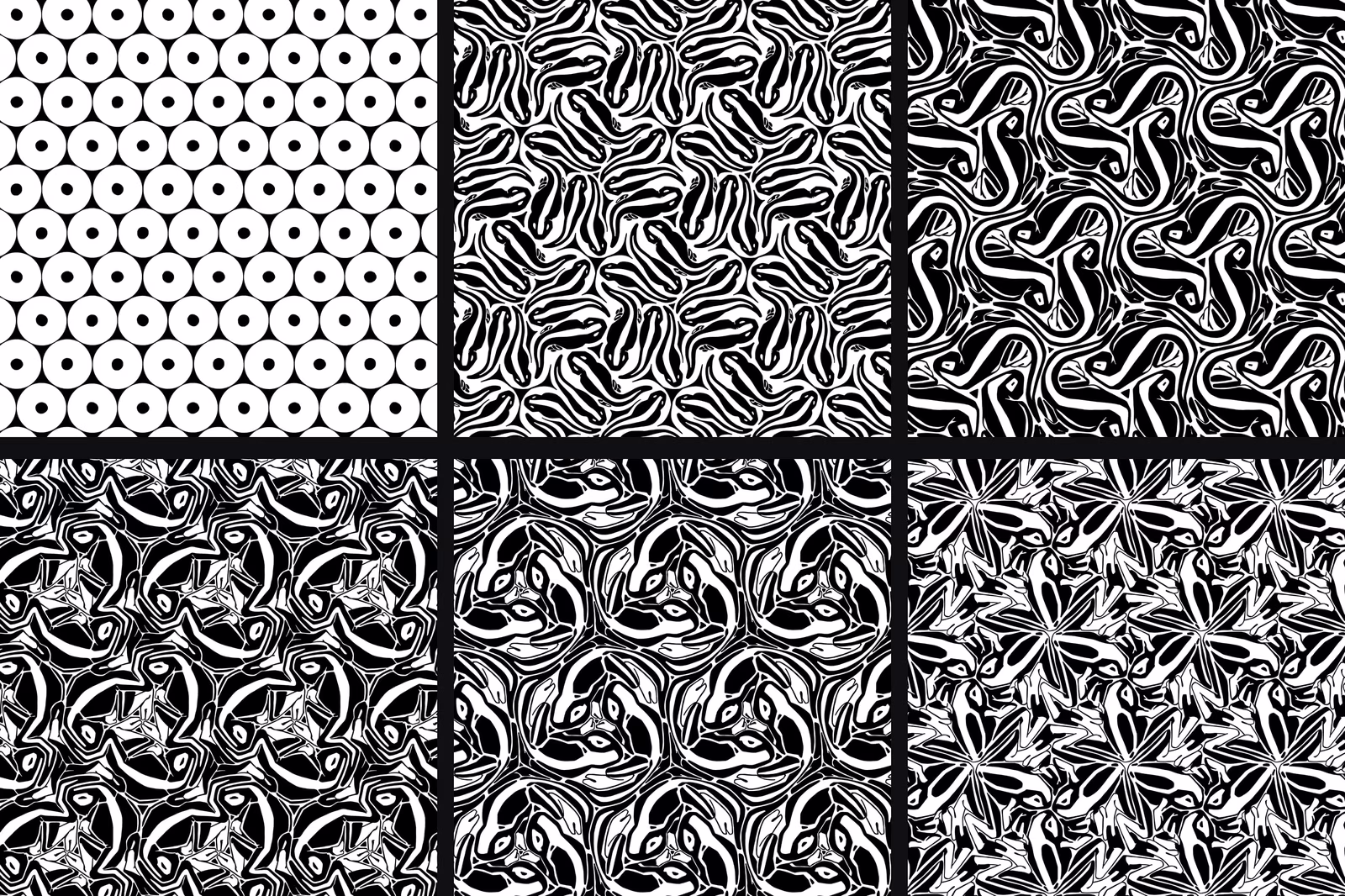
A. Bannwarth, Tessellations, digital, 2013-2020
Having created a number of tessellations over the years, the hexagonal type was the most intriguing and exciting to us.
M.C. Escher, Regular division drawing with lizards, no. 25, India ink, pencil and watercolor, 1939 / M.C. Escher, Reptiles, lithography, 1943
In his lithograph "Reptiles" and corresponding study "Regular division drawing with lizards, no. 25", the underlying hexagonal grid is clearly visible.
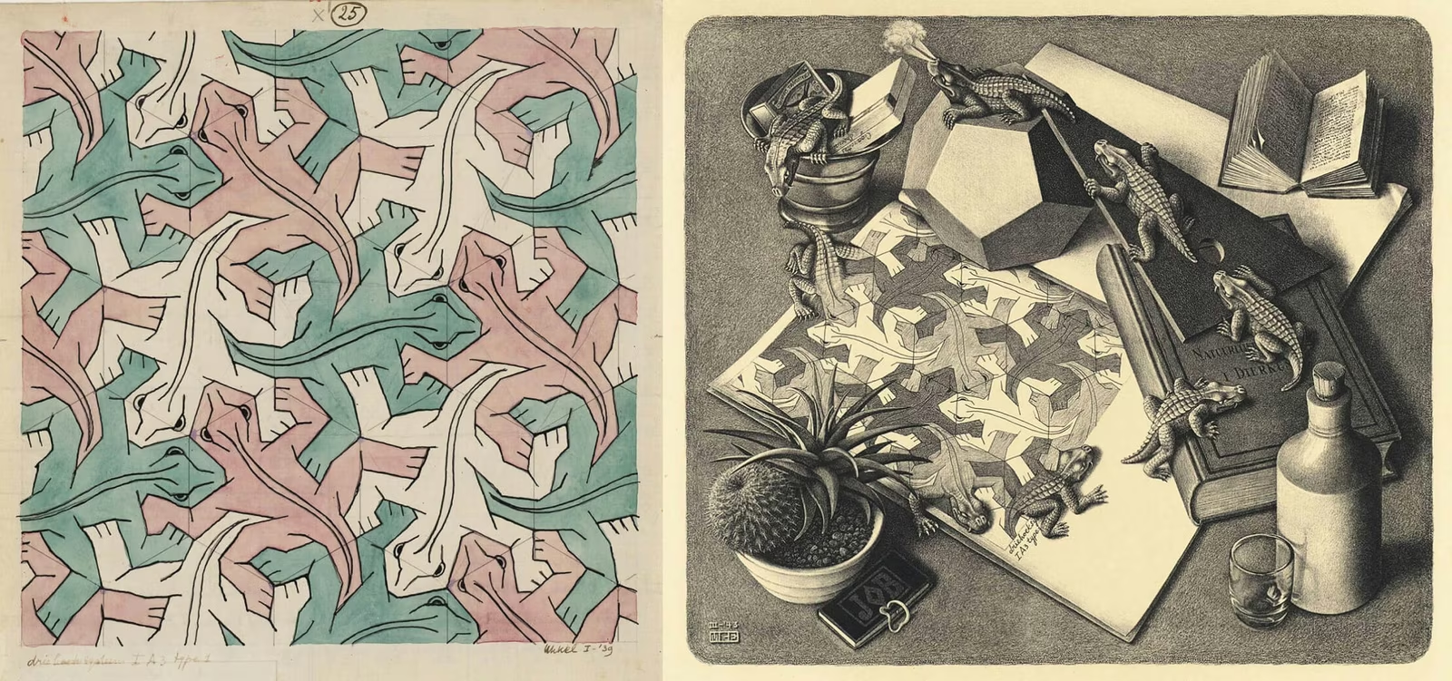
As we can see, each lizard's left eye meets at a vertex (corner) of the hexagon with the eyes of the two neighboring lizards who are simply rotated 120 degrees around said vertex. The same goes for the lizard's right knee and left foot. To recreate the pattern from a single tile we must thus simply rotate the hexagon twice 120° around every other of its corners. We can then repeat this process indefinitely to form a pattern of any desired size.
This infinite repeatability was appealing to us from a branding perspective, as we could use the same, easily recognisable tessellation artwork with great versatility across countless promotional channels. Business cards, merch, banners, social media, splash page, the possibilities would be endless.
Even with the help of copy pasting, designing such a pattern one tile at a time still requires ample imagination and trial and error to ensure the subject lines up perfectly and remains recognisable. But with the right software and some creative coding, the process can be massively optimised.
Leveraging Blender's 2D animation tools and instances, all that was needed was some code telling the software how to replicate our strokes in the correct location and rotation to conform to our hexagonal grid. The live instancing then allows one to draw one tile, and see the entire pattern update in real time.
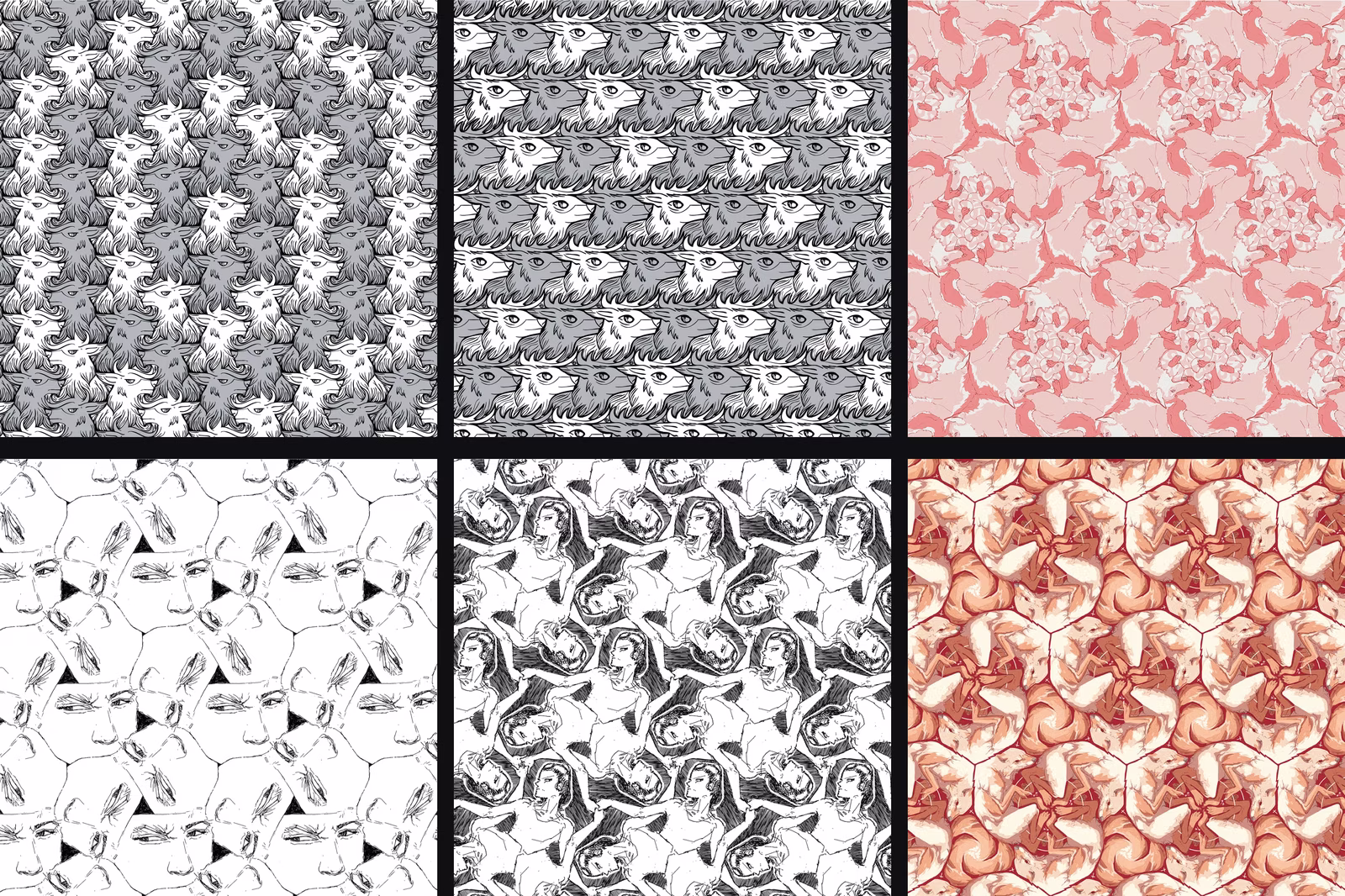
A. Bannwarth for Psychoactive Studios, Iterations on Frogs, digital, 2019
Being able to visualise the entire pattern as it is being drawn, while also having access to the fully fledged 2D animation tools of Blender's Grease pencil, made it possible to iterate quickly and efficiently produce original tessellations. We could now envision truly mesmerising our audience by animating the entire metamorphosis process, from egg to frog, as a seamlessly animating and repeating pattern.
Animating the Psychoactive Tessellation
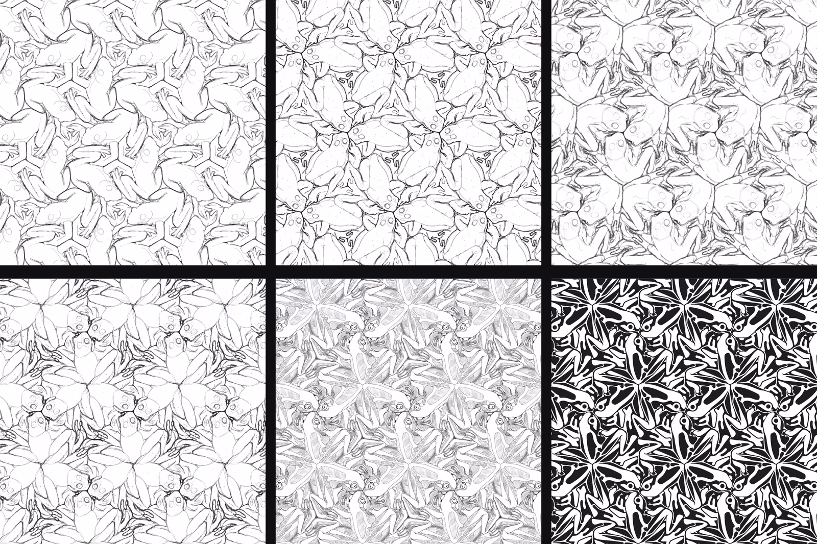
A. Bannwarth for Psychoactive Studios, Metamorphosis I - VI, digital, 2020
Despite the advantages of automation, producing such an animation still required great care, as fluid and natural motion had to be balanced against seamless tiling. The constraint of working within an interlocking pattern made a frame by frame approach essential. Yet even with a lot of experience designing for this specific hexagonal tiling, imagining the motion the frog had to take was far more challenging than in conventional frame by frame animation.
Every frame thus required lengthy trial and error to tease out consistent, recognisable, and aesthetically pleasing shapes that look good as a complete pattern. The stylized, very graphic art style allowed for a lot of playroom to twist and skew the tadpole into flowing and tillable shapes. Yet maintaining recognisable stages of metamorphosis still required a massive amount of time and iterations.
A. Bannwarth for Psychoactive Studios, Metamorphosis I-VI, animated, 2020.
In the end, the months-long process feels like a worthwhile effort, as the one-of-a-kind animation is the first thing users see of our website. An almost hypnotic metaphor for the metamorphic process that is design. Continuously hatching ideas that grow and evolve, like so many tadpoles, with only the finest reaching maturity as fully fledged projects and experiences. To us, it is an opportunity to visualise the psychoactive story, while expressing our identity and passion for innovation and technical mastery.
An almost hypnotic metaphor for the metamorphic process that is design.
We hope this article shed some light on the genesis of the Psychoactive Brand, as well as the thought process and technical considerations behind one of our more ambitious and intimate projects. We are always on the lookout for atypical, experimental, or mind-bending projects. If you have an idea that would fit the bill, or feel a unique tessellation is just what your brand needs to stand apart, we'd be stoked to hear from you.
What came next
This article covers the foundations: the name, the logo, the tessellation, the metamorphosis metaphor. All of that is still core to who we are.
What's evolved since 2021 is the studio itself: the work we take on, the tools we use, and the way we express the brand on our own website. In 2026 we relaunched as Psychoactive 3.0, and we wrote about that evolution in three companion pieces:
- How We Designed Psychoactive 3.0 by Andrew Hillstead. An overview of the redesign, the team, and why we built it custom rather than in Webflow.
- How we designed the new Psychoactive visual system by Serhii Churilov. The cinematic visual direction, the WebGL systems, and how the metamorphosis metaphor evolved.
- How we created the sound for the new Psychoactive website by Josh Waay. Designing every sound on the site from a single source sample, and the shift from background audio to interaction-based sound design.
The tadpole's grown. The studio's matured. The metamorphosis keeps going.