Share:


By Josh Waay, Sound Designer & Audio Developer
Almost every sound on the new Psychoactive website comes from a single source sample.
That's the choice I'm most proud of, and the one that shaped everything else. Before I get into how it worked, some context.
The brief
Andrew gave me six words to anchor a sonic identity: cosmic, digital, organic, futuristic, psychedelic, atmospheric. The previous Psychoactive site had persistent background audio. We agreed early on that v3 would go in the opposite direction: no constant soundbed, just subtle, interaction-based audio that makes the site feel more tactile without forcing itself on people who don't want it.
That meant every sound had to earn its place. A site full of small, well-considered cues is harder to design than one big atmospheric track, because each cue has to feel like it belongs to the same world. Cohesion was the brief inside the brief.
Sound design on this kind of site only works when it's part of the design conversation from the start, not bolted on at the end. So I worked closely with Serhii throughout, talking about weight and rhythm and timing as both visual and sonic decisions, because that's what they are.
A respectful first encounter
Most websites with sound startle you. Something autoplays the moment the page loads, and your first reaction is to find the mute button.
That's the user experience we wanted to avoid. The first time you hear anything on the new Psychoactive site is when you trigger it: by hovering, clicking, or interacting. Sound is opt-in by behaviour, not by checkbox. If you don't want it, you can keep your speakers off and the site still works perfectly. If you do want it, every interaction acknowledges you. That respect for the user's choice is, weirdly, what makes the audio feel premium rather than intrusive.
Why psytrance was the starting point
Most of the references I was given pointed to other websites. I moved away from those pretty quickly. Psychoactive's never really sounded like anyone else, and I didn't want the audio to be the part that fell into line.
So I leaned into music and video games instead. The screechy, squelchy textures of psytrance became the directional anchor. Two reasons: psychedelic is literally in the studio's name and part of the brand DNA, and psytrance was the soundtrack to a lot of the studio's early office days. There's a lineage there that goes beyond aesthetic. As a producer and DJ in genres adjacent to that, I had a head-start on using the correct production techniques.

One sample, everywhere
Cohesion was something Andrew and I had explicitly flagged as something to improve from the previous site. The way I went about it was probably extreme: I built almost every sound on the site from a single original source sample.
That's the tonal DNA. Every interaction, however different on the surface, traces back to the same audio fingerprint. When you click around the site, your ear can't necessarily articulate why everything feels like it belongs together, but it does, because it does.
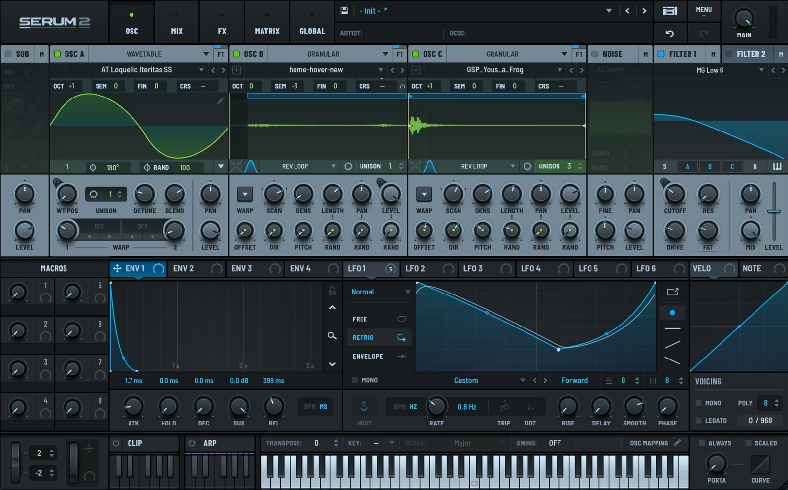
The challenge with that approach is that the source sample doesn't naturally fit every interaction. How do you turn a data-glitch texture into something that sounds like spherical movement, for the home logo hover? Or into a frog croak, for the Metamorphosis interaction on the About page?
The answer was XFER Serum 2, specifically its new Sample Oscillator, released in 2025. The Sample Osc lets you resynthesise an audio sample into something completely new while keeping characteristics of the source. The data-glitch could become a croak, a sphere, a swoosh, a thud: same DNA, totally different shape. Those transformations are some of the most experimental sound design I've done.
Frame-perfect
Once the sounds existed, they had to land at exactly the right moment.
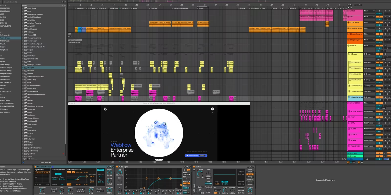
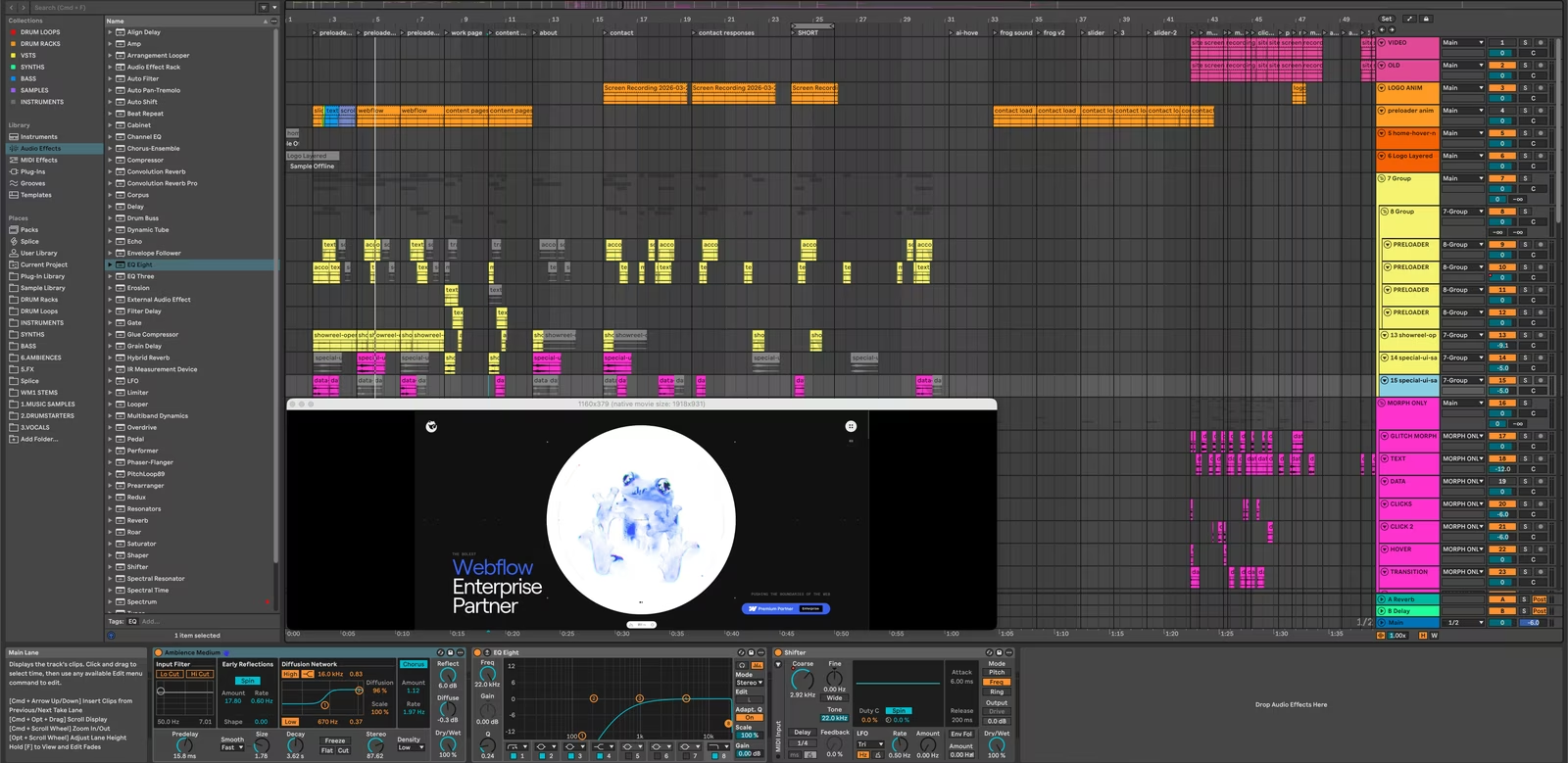
I worked in Ableton, which lets you drop a video onto the timeline and sync audio against it directly. That meant I could line up every sound against the actual visual it was triggering, frame by frame, and hear it in context as I built it. From there each sound got its own treatment: time-stretching, pitch-shifting, modulation, filtering, compression, EQ. Standard tools, used at high resolution.
What's not standard is how much weight I gave to weight itself.
The weight question
Every interaction on a website has a perceived weight. Light or heavy. Subtle or significant. A navbar opening shouldn't feel as important as the showreel launching, but if their sounds carry the same weight, the hierarchy collapses.
So opening the navbar gets a light swoosh. Triggering the showreel gets a much heavier, more layered version of the same gesture. That hierarchy runs through every cue on the site. The audio is doing the same job that typography or motion timing does in good design: it's telling you what matters.
The audio is doing the same job that typography or motion timing does in good design: it's telling you what matters.
A single space
The last unifying step was reverb.
I ran every sound through a convolution reverb with a large impulse response, using the same settings across the whole palette. It sounds like a small thing. It's not. It's what makes the entire audio system feel like it lives in one space, like every interaction exists in the same room. Without that final pass, you'd hear a collection of clever sounds. With it, you hear a unified world.
That cohesion is the part that's hardest to point at, but it's the part you'd miss most if it weren't there.
Building the system myself
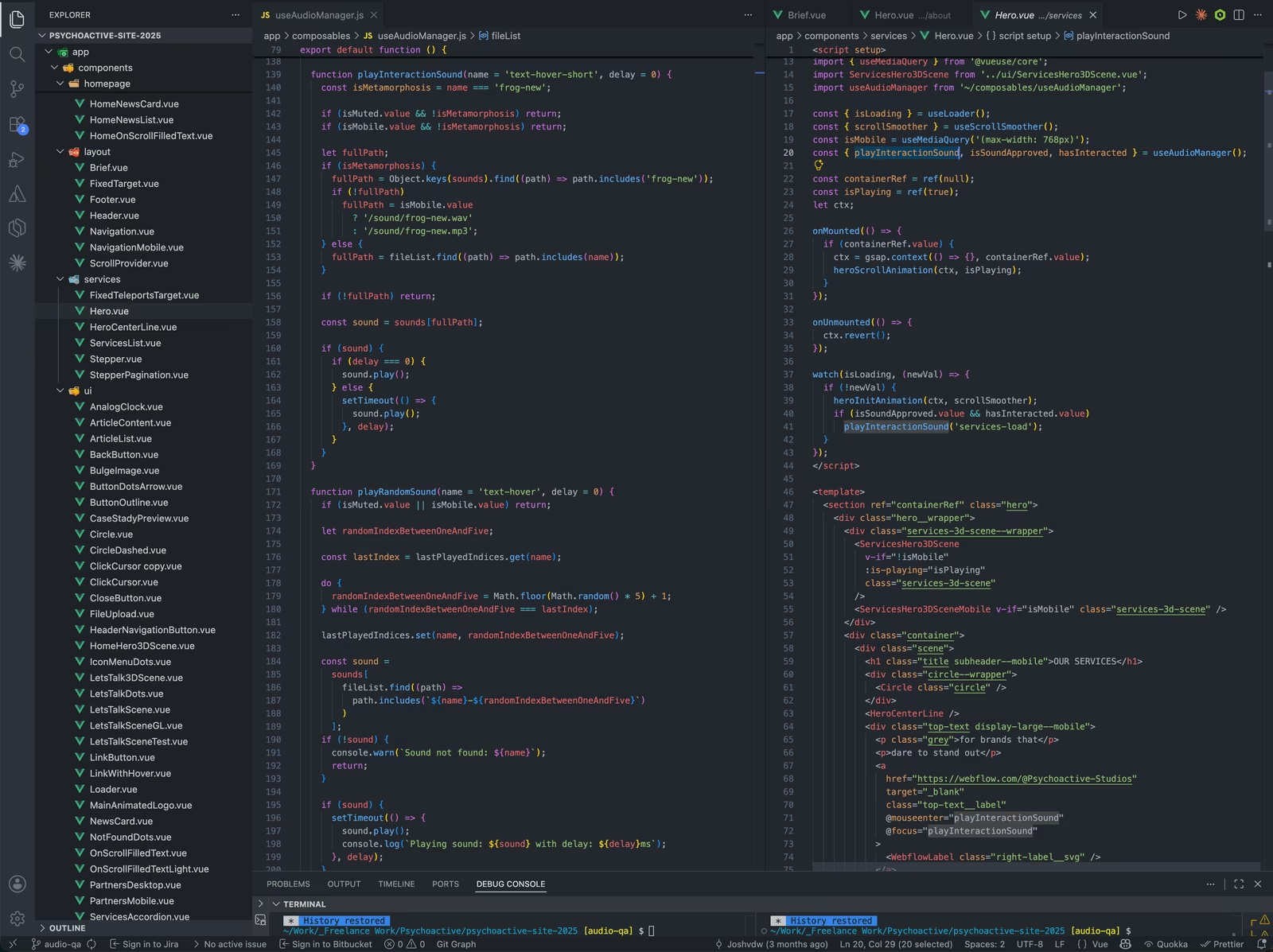
The last piece was implementation, and I wanted to own this end-to-end. The site is built in Nuxt and Vue. I come from a React and Next background, so Vue was new to me. The transition was smoother than I expected, and the logic for triggering audio on hover, click, scroll, and page change came together pretty quickly.
The system also had to handle mobile gracefully. Mobile browsers have stricter rules around audio (most won't play anything until the user interacts with the page first), and many people on mobile have their phone on silent anyway. The interaction-based approach made this much simpler to handle than persistent background audio would have. The audio system just waits for genuine user interaction before doing anything, which works the way mobile browsers expect, and respects how people actually use their phones.
Building it myself meant the audio system wasn't bolted on at the end. It was part of the same conversation as the visual design, from early prototypes through to launch, which is really the only way audio on a website like this can actually work.
What I'd take from this
Treating audio as a genuine layer of design (not decoration, not background, not afterthought) is something I'd love to see more of on the web. Most sites either ignore sound entirely or use it badly. There's a huge amount of room in between, and it's where some of the most interesting experience design is going to come from.
Treating audio as a genuine layer of design — not decoration, not background, not afterthought — is something I'd love to see more of on the web.
For Psychoactive 3.0, that approach turned a brief about feeling cosmic and atmospheric into something more specific: a website where every interaction has a small, deliberate moment of acknowledgement. Tactile. Earned.
I'm genuinely proud of what we made.
*Want the rest of the story? Andrew's piece on the broader redesign covers the strategy and team behind Psychoactive 3.0, and Serhii's piece on the visual system covers the cinematic direction the site took.*