Share:
By Andrew Hillstead, Founder & Creative Director
The new Psychoactive site is the third version of the studio's website. Each one's been a snapshot of where we were at the time. This one's by far the most ambitious.
The first one I designed and built myself on WordPress and Slider Revolution at the end of 2018, while travelling through Guatemala. A few months later, the original logo was co-created with my then-collaborator Alexandre Bannwarth. The second version launched in early 2021, alongside our shift to building primarily in Webflow. Around that time, Alexandre also created the animated tessellation that became one of the most defining parts of the brand, and which still lives on the About page of the new site. We wrote about all of that in detail back in 2021 if you want the full origin story of the logo, the tessellation, and the metamorphosis metaphor.
This version was a different kind of project.
By 2025, the studio was eight years old. We'd built websites for sold-out global events seen by millions (60,000-attendee World of WearableArt seasons, 50-million-view Summer Game Fest livestreams, the launch of SuperAI as the world's largest AI event), brand-defining platforms for AI-native startups, and immersive WebGL experiences for clients including Adidas, the All Blacks, Hellboy, Blackbird VC, and Token2049. Along the way, the work had quietly racked up more than 50 international awards and an Awwwards nomination for Agency of the Year. The old site had served us well, but it was starting to lag behind the work.
I first sketched out the v3 concept in mid-2023. That work paused during our company restructure later that year, and only picked back up properly in 2025, when I went looking for the right designer to reimagine the site. Within minutes of speaking with Serhii Churilov, a Ukrainian Design Director, it was clear he was the right fit. What started as a conversation about redesigning a single page quickly became a full redesign of the whole site. We shipped at the end of March 2026.
What stayed
A redesign is as much about what you keep as what you change.
The logo stayed exactly as it was. The tessellation stayed. The dark theme stayed. The "Digital Amphibians" identity stayed. The metamorphosis metaphor, the through-line that's been with us since day one, stayed too. We're still a studio that thinks of itself in terms of evolution, transformation, and the moments in between. None of that was up for negotiation. The original brand work was strong enough to grow into, not throw away.
The deepest thing that stayed isn't on the surface of the site. It's the question underneath it. Psychoactive started out of my Master's research on how technology could create meaningful emotional states, working with neurofeedback paired with AR and VR to simulate psychedelic therapy. That curiosity about how digital experiences can profoundly affect the mind has shaped how I think about the studio's work from day one. The whole studio is downstream of it. The new About page is the first time we've said that out loud.
What changed
Almost everything else.
The visual language matured. Where v2 was clean, structured, and classically web-design (black and white, Op Art-influenced, tight grids), v3 leans into something more cinematic. Atmospheric. The cosmic side of "psychoactive" is more present. Nature, digital structure, and abstract environments collide. Macro and micro shift back and forth. The whole thing feels more like a film than a website, which is exactly what Serhii and I were after. He's written about the visual thinking in much more depth in his own article, and it's worth a read.
The sound changed completely. The previous site had persistent background audio, which we always knew was a friction point. Not everyone wants sound, and forcing it on people felt heavy-handed. For v3, we focused on subtle, interaction-based sound design: a light swoosh when you open the navbar, a heavier, more layered cue when you trigger the showreel. There was no one better to bring that to life than Josh, a DJ, sound engineer, and developer, who designed the entire sonic palette and built the audio system himself. He's also written about that craft in his own article, and it's worth your time too.
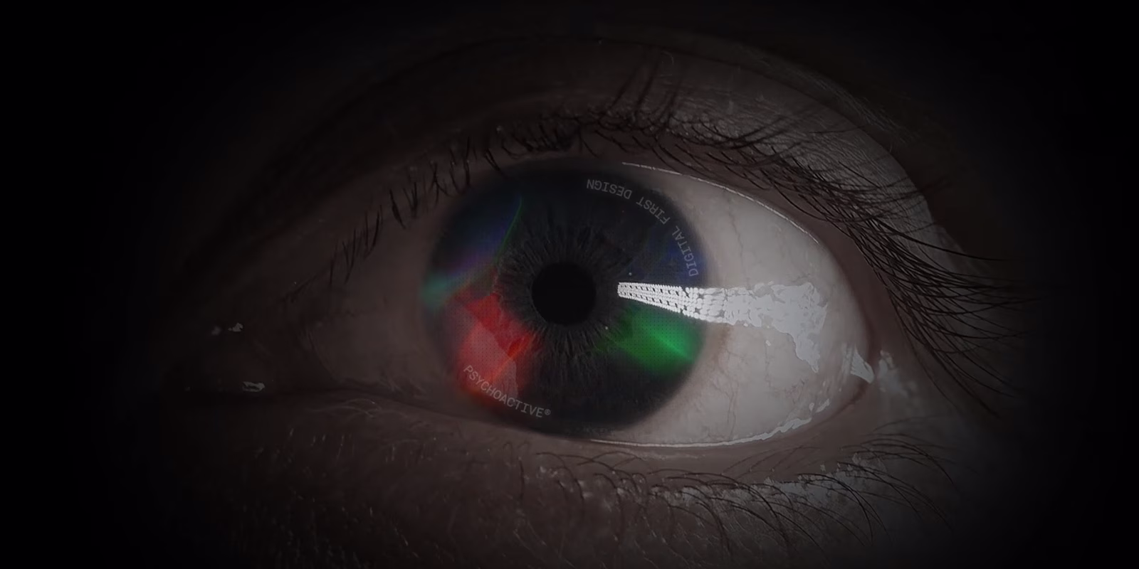
The case studies became the beating heart of the site. Most agency case studies are thin: a screenshot, a logo, a paragraph of marketing language. Ours had to do real work: walk you through how a project was made, what we were thinking, what changed along the way. Serhii and Alex Nelson worked through every project with that depth. They're not perfect, and they're never going to be. In an ideal world every one would have richer video and interactive moments, but at every studio you trade depth against time. What shipped, I'm proud of. The new showreel, which I co-created with Serhii, opens with a descent through an eye into the Psychoactive universe and now plays directly on the homepage.
The About page got a complete rewrite. Born Amphibious opens it, followed by an honest Our Story section, a dictionary-style entry for Metamorphosis redefined for digital transformation, and the team named with photos. The tessellation lives there as a centrepiece, with full credit to Alexandre Bannwarth, who created the original animation in 2020. It's the most honest expression of who the studio is that we've ever published.
The Services page was rebuilt around four pillars: Brand & Strategy, Design & Motion, Development, and Growth & Partnership. Each one now has AI woven through it, because that's how we actually work. The page's framing line is the cleanest expression of that: AI runs through every phase of our pipeline. It sharpens research, accelerates design, and automates what used to slow us down, without ever replacing the craft.
Why we went custom (and not Webflow)
This was probably the single biggest decision in the project, and it surprised some people.
We're a Webflow Enterprise Partner. We've been one since 2022. Webflow is a huge part of what we do for clients. So why didn't we build our own site in Webflow?
Honest answer: the level of customisation we wanted (the WebGL, the dot-based interactive systems, the warp hover effects, the page transitions, the audio implementation) would've been a stretch on Webflow. Possible, probably. But not the right tool for what we were trying to make. We needed full control of the front end, full control of the audio system, full control of the rendering pipeline.
So we went custom. The site is built on Nuxt and Vue, with Strapi as the CMS, Supabase powering the AI Design Audit tool, and Vercel for hosting. Custom code throughout. Which meant I needed a developer who'd worked on this kind of build before, and who could collaborate intimately with Serhii. After some searching, I committed to working with Dmytro Oborskyi, who, like Serhii, is also Ukrainian. It was a bit of a gamble. It paid off in a way I genuinely couldn't have predicted. Dmytro built every interaction Serhii imagined, in real-time WebGL, on a custom stack that has to handle dense visual systems running smoothly across devices. The visual system on this site only exists because he built it.
To be clear, this isn't a vote against Webflow. For many of our clients, it's genuinely the right tool: fast to build in, scales well, and the right call for the majority of brands we partner with. The question we ask on every project is: what does this specific build actually need? Most of the time, the answer is Webflow. Sometimes, when the level of customisation, interactivity, or technical control demands it, the answer is custom code. Our own site fell into that second category. Knowing which is which, for each individual client, is part of the job.
What it expresses
The brand grew up.
v1 was a portfolio. v2 was a Webflow agency announcing itself. v3 showcases Psychoactive as an AI-era design and development agency for ambitious brands. It's the studio at eight years old, with the confidence to commit to a specific point of view: that the web should feel alive, considered, atmospheric, and earned. That every interaction is an opportunity. That sound, motion, typography, and code are all part of the same system.
The site is the work now, not the showcase for it.
What I learned
Shipping this taught me a few things that won't leave me.
One: the temptation to keep going is endless. There's always one more iteration, one more polish pass, one more thing that could be tightened. At some point, you have to ship. The site live is better than the site perfect, because the perfect version doesn't exist. We pushed the bar where it counted and let go of the rest.
Two: the right team makes decisions a brief never could. Serhii arrived at things I wouldn't have asked for, that turned out to be exactly what the project needed. Dmytro built things I didn't know were possible. Josh treated audio as a first-class layer of design when most studios still treat it as decoration. Hiring well is the highest-leverage thing a founder does. This project made that obvious.
Hiring well is the highest-leverage thing a founder does.
Three: be honest about what the work is doing. Most agency sites pretend their portfolio speaks for itself. It rarely does. The case study writing, the About page rewrite, the AI integration on the Services page, the audio system, the cinematic motion design: they all do work that a row of project tiles couldn't. The site is the work now, not the showcase for it.
A note on AI
We're a studio that designs and builds for the AI era. Which makes a fair question: did we use AI to design and build this site?
The honest answer is yes, but probably not in the way you'd assume.
The foundation of the site (the visual system, the case studies, the motion design, the audio, the front-end code) was designed and built by people, the traditional way. That was a deliberate call. We wanted full control of every detail, and the kind of considered craft Serhii, Dmytro, Josh, and the team brought to this project depends on hundreds of small human judgement calls that don't come out of a model. AI couldn't have made the decisions Serhii made about rhythm and texture, or the calls Josh made about weight and timing, or the structural choices Dmytro made in the Vue components. Those are human decisions, and we wanted them made by humans.
What AI did help with, significantly, is everything that lives on top of that foundation:
- Copy iteration. Writing positioning copy is hard, slow work. AI accelerated the iteration loop on every page, helping us stress-test phrasing, trial alternatives, and refine the studio voice across the homepage, About, Services, and case studies. Final calls were always human; the velocity changed.
- Code, debugging, and performance. From SSR fixes to refactoring WebGL contexts to systematic accessibility passes, AI sped up the kind of grunt work that used to eat days. It didn't write the architecture; it helped us iterate within it faster.
- Visual generation. The psychedelic video that appears in a few places on the site was made with Midjourney, then composited and animated by hand in After Effects. Team headshots were polished with Nano Banana. AI was a starting point in both cases, not a finished output.
- Technical SEO and structured data. AI helped us systematically audit and improve the technical foundations of the site: meta descriptions, schema markup, alt text, ARIA labels, reduced-motion handling.
And there's one piece of the site that is AI, end to end: the Design Audit tool in our Content Hub. We built it during this project. Give it a URL and it returns a critique of the site's design, copy, and positioning. We ran it on our own site early on and scored 31/100. That score became the brief for almost everything we did next. After the relaunch, we re-ran it and scored 73/100. We're still optimising. The tool's now live, public, and free to use.
That's how we think about AI in client work, too. The foundation is craft, built by people who know what they're doing. AI is a tool that lives on top of that, helping us iterate faster, test more directions, and ship better work. It's not a replacement for the work; it's a way to do more of the work, better.
The team
I want to name everyone, because this was genuinely a team effort.
Serhii Churilov as Design Director. Within minutes of our first conversation, I knew he was the right person for the job. He's brought a clarity and a cinematic instinct to this site that's reshaped how I think about studio design.
Dmytro Oborskyi on development. The technical heart of this project. Building real-time WebGL systems on a custom Nuxt stack, with cross-device performance and a long list of edge cases, is genuinely hard work, and Dmytro made it look composed.
Josh Waay on sound design and audio implementation. A DJ, sound engineer, and developer who designed the entire sonic palette from a single source sample, then built the audio system into the site himself.
Alex Nelson and Serhii Churilov on case study design: the part of the site that does the heaviest lifting for prospects, and the part with the highest standard for craft.
Luca on project management, keeping every detail aligned and the whole thing moving.
Andrew Hillstead on copy writing, design, creative direction, and development. Hundreds of my own hours on the strategic and creative direction; thousands more from the team collectively.
I'm extremely proud of what we've made together.
Quick answers
What's the tech stack? Nuxt and Vue on the front end, Strapi as the CMS, Supabase powering the AI Design Audit tool, and Vercel for hosting. Custom code throughout. No Webflow on this build, though it remains the right call for most of our client work.
Did you use AI to build the site? The foundation was designed and built by people. AI helped with copy iteration, code work, visual generation (Midjourney for the psychedelic video; Nano Banana for headshot polish), and the technical SEO and accessibility passes. The Content Hub also includes a public AI-powered Design Audit tool we built into the site itself.
Who built it? Andrew Hillstead (copy writing, design, creative direction, development). Serhii Churilov (design direction). Dmytro Oborskyi (development). Josh Waay (sound design and audio implementation). Alex Nelson and Serhii Churilov (case study design). Luca (project management).
When did it launch? End of March 2026.
Does it work without sound? Is it accessible? Yes. The audio is opt-in by behaviour: nothing plays until you interact with the page, and you can ignore it entirely without losing anything. We also did a full accessibility pass on the build, covering keyboard navigation, focus states, ARIA, alt text, and reduced-motion support.
Why custom code instead of Webflow? The level of WebGL, real-time interaction, and audio system control we wanted demanded full ownership of the front end. For most client projects we still recommend Webflow.
The longer version
This is the high-level story. The deeper pieces (what Serhii was actually thinking when he designed the visual system, and how Josh built the entire sonic palette from a single source sample) are worth their own articles, and we've published them separately:
- How we designed the new Psychoactive visual system by Serhii Churilov
- How we created the sound for the new Psychoactive website by Josh Waay
And if you'd like to read where this all started, How We Designed the Psychoactive Brand Identity (2021) is still up. The logo, the tessellation, the metamorphosis story. That's where it all began.
*Have a project that deserves this kind of craft? Drop us a line at hello@psychoactive.co.nz. We'd love to hear about it.*