Share:


By Serhii Churilov, Design Director
The brief was straightforward and impossible at the same time: design a studio website that doesn't feel like a studio website.
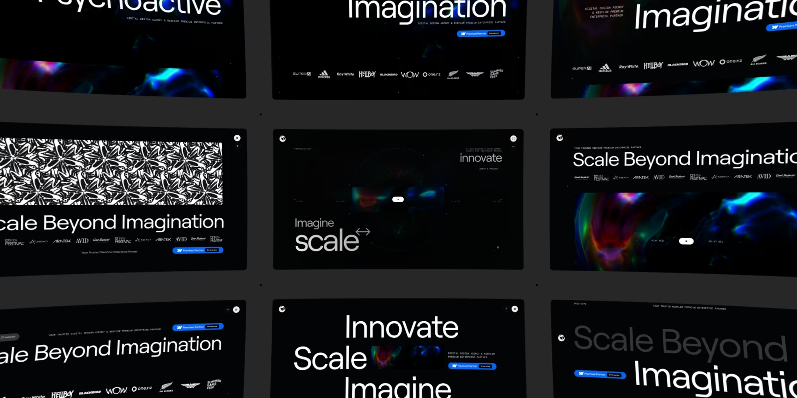
A portfolio is the obvious format for an agency. Show the work, show the team, show the contact form. Done. But Psychoactive isn't a portfolio kind of studio, and Andrew was clear from the first conversation that v3 needed to be something else: closer to a film than a website, closer to an environment than an interface.
That's the direction I worked towards. Here's how it came together.
Cinematic, not static
Most websites prioritise stillness. Things sit on a page and stay there. You scroll, you read, you click. The interface is the substrate; the content sits on top of it.
I wanted to flip that. On the new Psychoactive site, the interface isn't a substrate. It's part of the experience. Atmosphere, rhythm, and immersion come first, and the usability lives inside that, not under it.
That decision shaped everything downstream. It's why the site uses motion the way a film uses motion, why transitions are treated as core design moments rather than connective tissue, and why scrolling feels less like reading and more like moving through space.
Metamorphosis 2.0
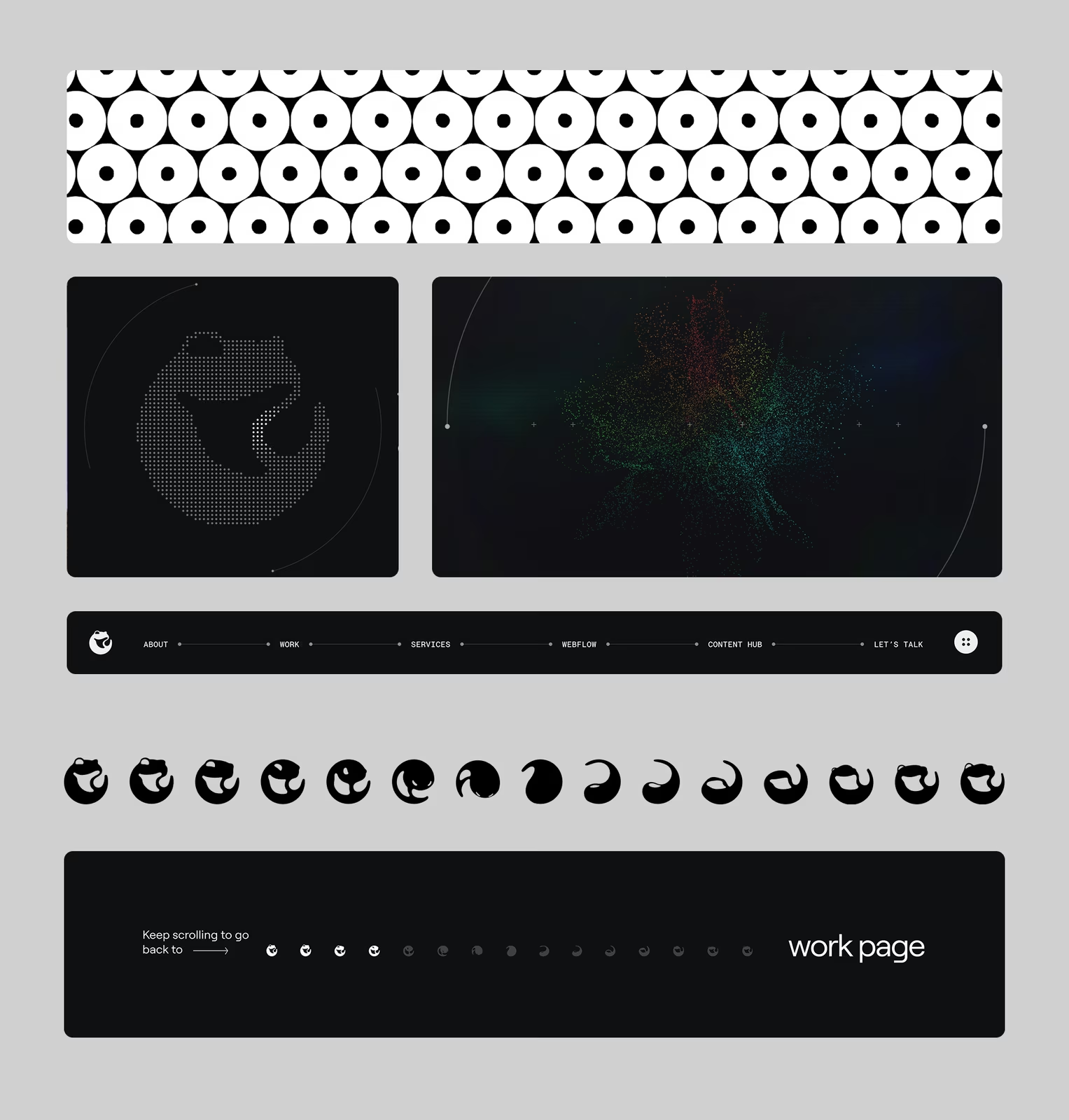
The metamorphosis idea isn't new for Psychoactive. It's been the conceptual heart of the studio since 2018, and the original 2021 site explored it through the tessellation and the frog. I wanted to keep the metaphor but take it somewhere different.
So the new site treats metamorphosis as a journey, not a static metaphor. You move from macro to micro, from abstract environments down into organic forms. Frogs, tadpoles, eggs, cell division: the visual language draws on the same vocabulary the studio's always used, but stretched out across a sequence rather than locked into a single illustration. The point isn't here is a frog. It's here is the process of becoming, played out across the whole experience.
The original tessellation still lives on the About page, exactly where it should be. It's the artefact of the previous chapter, sitting inside the new one.
A hybrid aesthetic
The visual language blends three worlds: nature, digital structure, and cosmic environment.
Nature gives us the organic forms: the metamorphosis vocabulary, the textures, the suggestion of life and growth. Digital structure gives us precision: grids, dot systems, code-driven motion, technical typography. The cosmic layer is what holds them together: atmosphere, depth, the sense that everything is happening somewhere larger than a screen.
None of these elements work alone. Pure nature would feel too soft for the studio. Pure digital would feel cold. Pure cosmic would feel like a sci-fi pitch. The hybrid is what makes the site feel like Psychoactive specifically: a studio that's simultaneously precise and strange, technical and atmospheric.
Contrast as the engine
The system runs on contrast.
Motion against stillness. Noise against silence. Density against minimalism. Macro against micro. The site moves between these poles deliberately. Fast, dense moments give way to slow, quiet ones, and back again. That rhythm is what makes the experience feel alive. A website that's all motion is exhausting. A website that's all stillness is dead. The interesting territory is the timing between them.
This is also why the site doesn't try to be loud everywhere. Plenty of moments are deliberately understated, because understatement is what makes the loud moments land.
Real-time, not pre-rendered
Most of the visual systems on the site are powered by WebGL, which means they respond to what you actually do, not to a pre-recorded path you're watching.
The dot-based visual systems and warp hover effects respond directly to your cursor. Project previews behave like reactive environments. Hovering over something doesn't trigger an animation; it shifts a state. That distinction matters. Pre-rendered motion is a performance you watch. Real-time motion is something you participate in. For a site about transformation, the second one was the only honest option.
Pre-rendered motion is a performance you watch. Real-time motion is something you participate in.
This is also where the technical bar got serious. Real-time WebGL on a site this dense, running smoothly across devices, isn't trivial. It needed a developer who could work intimately with the design intent, and Dmytro Oborskyi delivered on that. The visual system and the build are genuinely inseparable. Neither would exist without the other.
We also had to think about accessibility from day one. A cinematic, motion-heavy site is a problem for anyone with motion sensitivity, vestibular issues, or simply a preference for less movement. So the whole motion system honours the user's reduced-motion setting at the OS level: if you've asked your device for less motion, the site listens. Cinematic design and accessible design aren't opposites. The discipline is making sure they ship together.
Typography
Typography on the site does two jobs at once.
Roobert is the workhorse: clear, readable, neutral enough to disappear when the content needs to speak. Roobert Mono is the technical voice: the layer that signals precision, code, system, structure. Pairing them gives the interface both registers without needing a third typeface, and the contrast between them quietly reinforces the broader contrast running through the design.
Type is one of those things people only notice when it's wrong. We spent a disproportionate amount of time on it for that reason.
Designing with sound, not for it
One of the most important decisions early on was that the sound design wouldn't sit on top of the finished site. It would shape it.
Josh Waay built the entire sonic palette in dialogue with the visual system. We talked about the weight of interactions (light or heavy, subtle or significant) as both visual and sonic decisions, because they are. A swoosh that sounds light needs to feel light too, and that means the motion and the audio land together. Designing the visuals first and then asking someone to score them afterwards never produces this kind of cohesion. Josh's piece on the sonic identity goes deep on the audio specifically; what I'd say from the visual side is that the site moves the way it does partly because we knew it was going to sound a certain way.
Transitions as design, not glue
On a lot of websites, transitions are filler: a fade, a slide, something to cover the load. On this one, they're the design.
Page changes are continuous. There's no hard cut between sections of the site, no jarring snap from one context to another. The whole experience unfolds as a single flow, which is the only way the cinematic approach actually holds together. The moment you break that continuity with a standard page transition, the spell breaks.
That continuity is also a constraint. Every new section we designed had to consider how you arrive at it and how you leave it. Sections didn't get designed in isolation and then stitched together. They were always designed as part of a journey.
Working across the world
Andrew's in Wellington. I'm in Kyiv. Eleven hours between us, almost no overlapping working day. On paper, the kind of distribution that derails a project like this one.
In practice, it didn't. The whole thing ran on very frequent communication and open discussion, with the assumption that nothing was finished until the team had argued it out together. We spoke daily, often more. Andrew would write up his thinking at the end of his day; I'd respond at the start of mine. Big decisions got hashed out in long video calls; smaller ones went back and forth in chat until they were right. Josh and Dmytro were in the same conversations from early on, which is why the visual system, the audio, and the build feel like one thing rather than three.
You can feel that in the work. A site like this doesn't come from a designer sketching on their own and handing it over. It comes from a team that's actually talking, all the time, across whatever distance there is.
Process
On iteration
The homepage hero alone went through more than fifty distinct iterations before we landed on what shipped. Other pages followed similar paths. Most of those changes were small: a tightening here, a recalibration there, a different timing curve, a colour pulled half a step. But the cumulative gap between version one and what's live now is enormous.
Cinematic design isn't made in a single creative leap. It's made in fifty patient ones. That's what people don't always see when they look at a finished site: the dozens of versions underneath it, each one slightly closer to a feeling that was hard to name when we started.
Cinematic design isn't made in a single creative leap. It's made in fifty patient ones.
The showreel
The showreel extends the same logic into pure motion.
It opens with a descent through an eye into the Psychoactive universe. The eye isn't decoration. It's a deliberate threshold. Psychoactive literally means capable of profoundly affecting the mind; the studio's been built around that idea since 2018. Entering through an eye is the visual equivalent: you're not on a homepage, you're moving through perception into somewhere else. From there, the showreel moves through curated fragments of client work: Adidas, the All Blacks, Summer Game Fest, Hellboy, World of WearableArt, SuperAI, Token2049, Blackbird VC, Zendetta. Each fragment is picked for emotional charge rather than narrative completeness. Most agency showreels try to tell you about every project. We deliberately didn't. The point isn't here's everything we've done. It's here's how the work feels.
Editing alternates between fast cuts and slow pauses. Same rhythm logic as the site itself. The brand identity supports each piece of work without flattening it; every project keeps its individual character inside the shared atmosphere.
The showreel doesn't end with a fixed conclusion either. It leaves space: for interpretation, for your own read of what transformation means. That's intentional. A studio that closes every loop for you is a studio that's stopped being interesting.
What I hope it does
If a visitor finishes the site feeling like they've passed through somewhere, rather than scrolled down a page, then the system is doing what it's meant to do. That's the whole brief. Atmosphere over interface, environment over portfolio, journey over destination. A studio that builds the kind of work it makes for its clients, on its own front door.
*The full picture of Psychoactive 3.0 sits across three pieces: Andrew's overview of the redesign, Josh's article on the sonic identity, and this one. And if you want the origin story (the logo, the original tessellation, the metamorphosis metaphor), the 2021 brand identity article is still up.*